Jason Wang

App Design /2017
The project goal is to find the pain points when users use a mobile application and redesign this mobile app to meet user needs. I chose to redesign the Checkout 51 to improve user experience and increase user engagement.


What is

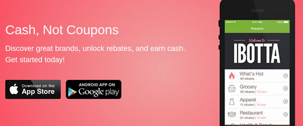
The Checkout 51 is a rebate mobile app which can help users to earn cash back after they finish shopping, the users can browse the offers on the app and buy products at any stores. After they upload their receipt with Checkout 5, their accounts would be credited. When users' account balance reaches $20, they can cash out, and Checkout 51 will mail them a check.
New offers every week


Scan your receipt

Get your cash back

Special event offers

Business model
How does the Checkout 51 make money?
Unlike other rebate applications, the Checkout 51 runs a unidirectional business model.The Checkout 51 gets benefits from brands, which, in fact, depresses its user engagement.Since there is no access for users to interact with this mobile application to get offers they want.As a result, the Checkout 51 updates hundreds of offers that its users don't need. The Checkout 51 might know this truth. However, they have no incentive to change this situation.
Current problems
1.
Every Thursday morning, Checkout 51 updates new offers to its user list.However, many are on products people never purchased, and they seem never to be replaced with better offers.users need to spend a long time growing the list to figure out what they want.
2.
The biggest complaint from users is the difficulty in scanning a receipt into the app.Users have to take a photo of their receipt whenever they finish shopping.
3.
It is very easy to lose your patience when you get your cash back after 24 hours.Furthermore, the application lacks interaction with its users.
Customer journey map
A customer journey map is a tool which helps to consider the interactions from the users’ point of view.It can be used to highlight the pain points of the user and uncover some essential opportunities for users, such as the possibility to add more offers that customers need. From the customer emotion graphic, it is easy to distinguish the peaks and valleys of users’ feeling, to figure out which phase that users care most about.

Competitive Analysis
I conducted a competitive analysis to view some applications similar to the Checkout 51.It was an opportunity allow me to understand the way that the competitors highlight their features.With further exploration, I tried to figure out what I can learn from the competitors to solve the Checkout 51's problem.

Among these rivals, the Ibotta is the most successful one in the current market.There are several features attracting users to use it more frequently.In fact, it encourages users to build a rebates community by themselves.It absolutely is an amazing feature, however, I thought it does not fit with the Checkout 51 because of their different business models.Instead of this, I used another Ibotta feature to make it easy for users to find offers in the grocery store.
Insights
-
It is true that many offers from Checkout 51 offer on products that users rarely purchase, however it doesn’t mean these offers are useless.
-
Adding more offers is the best way to make Checkout 51better, unfortunately, it is beyond the capability of a UX design.
-
The value of an offer more depends on how popular it is rather than how much cash back it gives to the users.
Ideation

Sketching
Throughout this project, my sketchbook is an instrumental tool to visualize my concept.Being able to quickly iterate with my sketchbook, I could create and alter ideas with the stroke of a pen. This enabled me to get instant feedback from my peers on marketing and product concepts, allowing me to iterate on concepts rapidly.
Affinity mapping
After I obtained an abundance of data from my research, and through my ideation process, I used sticky notes repeatedly to organize my thoughts. I used sticky notes in mapping potential user flows and in my competitive analysis.

The Checkout 51 is an innovative mobile application, but there is still a huge space to increase its user engagement and its market acceptance. By changing the approach of push notification, Checkout 51could help the user to create a new shopping habit which can increase its user engagement.
Search for the offer

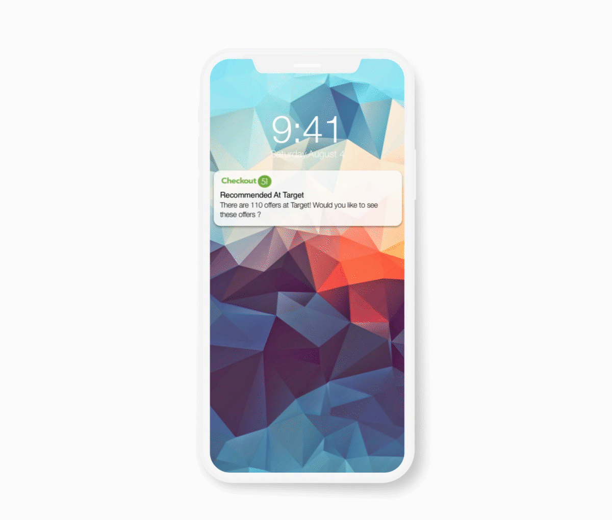
Piggy Bank


Piggy Bank is a feature to help users to create a new habit when they stop at grocery stores.For instance, if there is a user shopping at Target,Checkout 51 will send the user a notification to remind him/her that they can Check all the Checkout 51 offers from Target. This feature will not only make Checkout 51 easy to use but can help to increase customer use of Checkout 51.However, to avoid to send users the wrong notification, Checkout 51 will not push the notification until users stay at the grocery location for 5 mins
Check the offer
Location. Description.Time limit
Claim the offer
Multiple ways to claim the offer
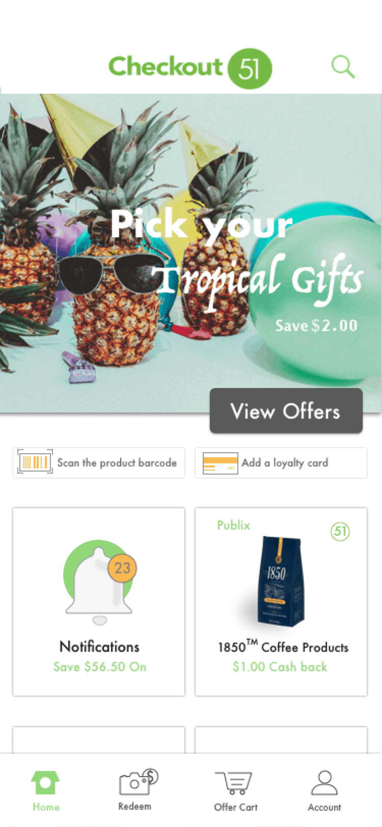
Scan the barcode.Add your loyalty card.

